
Bike Sharing Demand 링크: Bike Sharing Demand
Github Code: Unifinished God/Kaggle
0. Kaggle - Bike Sharing Demand
캐글 데이터 분석을 해보자. Bike Sharing Demand라는 주제로 자전거가 얼마나 대여가 될지 예측을 하는 문제다. 타이타닉 만큼 기본 주제로 여겨지며 XgBoost도 공부 해볼겸 한번 써보려 한다.
0.1 데이터 다운로드
데이터는 캐글의 Data시트에서 다운을 받으면 된다. 후에 api를 사용한 방법도 추가 하도록 하겠다.

0.2 평가
평가는 RMSLE(Root Mean Square Logarithmic Error)로 하며 이는 RMSE에 각각 log를 씌운것으로 오차에 대해서 과대평가된 항목보다 과소평가된 항목에 패널티를 더 주게 된다. 식은 다음과 같다.
\[ \sqrt{\frac{1}{n} \sum(\log(a_i + 1) - \log(a_i+1))2 } \]
0.3 데이터 형식
Bike Sharing Demand 의 데이터는 다음과 같다. 이중에서 casual, registered는 test_set에 없어서 사용하지 않을 것이고, 날짜와 날씨 데이터로 이루어져 있다.
- datetime: 년-월-일 시간 데이터
- season: 1 = 봄, 2 = 여름, 3 = 가을, 4 = 겨울
- holiday: 공휴일 또는 주말
- workingday: 공휴일, 주말을 제외한 평일
- weather
- 1: 매우 맑음(Clear, Few clouds, Partly cloudy, Partly cloudy)
- 2: 맑음(Mist + Cloudy, Mist + Broken clouds, Mist + Few clouds, Mist)
- 3: 나쁨(Light Snow, Light Rain + Thunderstorm + Scattered clouds, Light Rain + Scattered clouds)
- 4: 매우 나쁨(Heavy Rain + Ice Pallets + Thunderstorm + Mist, Snow + Fog)
- temp: 기온
- atemp: 체감온도 정도로 보자
- humidity: 상대 습도
- windspeed: 바람의 세기
- casual: 미등록 사용자 렌탈 수
- registered: 등록된 사용자 렌탈수
- count: 렌탈한 총 합
1. 사전준비
분석을 하기에 앞서, 패키지를 불러 오고 데이터를 파악 해보자.
1.1 Load Packages
불러올 Packages는 다음과 같다.
library(tidyverse)
library(lubridate)
library(stringr)
library(caret)
library(readr)
library(gridExtra)
library(xgboost)
library(Metrics)
library(ggplot2)
library(patchwork)
1.2 Data Load & 전처리
데이터를 불러오고 전처리를 해주도록 하자. xgboost를 사용하기 위해선, 각각의 데이터는 모두 숫자형으로 표현 되어야 한다. 날짜 데이터는 년, 월, 시간, 요일로 따로 데이터를 불러 오도록 하자.
train_set <- read_csv("train.csv")
test_set <- read_csv("test.csv")
# submission <- read_csv("sampleSubmission.csv")

# remove casual registered
train_set <- train_set %>%
  select(-casual, -registered) %>%
  mutate(
    year = year(datetime),
    month = month(datetime),
    hour = hour(datetime),
    wday = wday(datetime))


test_set <- test_set %>%
  mutate(
    year = year(datetime),
    month = month(datetime),
    hour = hour(datetime),
    wday = wday(datetime))
1.3 데이터 자료형 파악
str(train_set)## tibble [10,886 × 14] (S3: tbl_df/tbl/data.frame)
## $ datetime : POSIXct[1:10886], format: "2011-01-01 00:00:00" "2011-01-01 01:00:00" ...
## $ season : num [1:10886] 1 1 1 1 1 1 1 1 1 1 ...
## $ holiday : num [1:10886] 0 0 0 0 0 0 0 0 0 0 ...
## $ workingday: num [1:10886] 0 0 0 0 0 0 0 0 0 0 ...
## $ weather : num [1:10886] 1 1 1 1 1 2 1 1 1 1 ...
## $ temp : num [1:10886] 9.84 9.02 9.02 9.84 9.84 ...
## $ atemp : num [1:10886] 14.4 13.6 13.6 14.4 14.4 ...
## $ humidity : num [1:10886] 81 80 80 75 75 75 80 86 75 76 ...
## $ windspeed : num [1:10886] 0 0 0 0 0 ...
## $ count : num [1:10886] 16 40 32 13 1 1 2 3 8 14 ...
## $ year : num [1:10886] 2011 2011 2011 2011 2011 ...
## $ month : num [1:10886] 1 1 1 1 1 1 1 1 1 1 ...
## $ hour : int [1:10886] 0 1 2 3 4 5 6 7 8 9 ...
## $ wday : num [1:10886] 7 7 7 7 7 7 7 7 7 7 ...1.4 데이터 요약
summary(train_set)## datetime season holiday
## Min. :2011-01-01 00:00:00 Min. :1.000 Min. :0.00000
## 1st Qu.:2011-07-02 07:15:00 1st Qu.:2.000 1st Qu.:0.00000
## Median :2012-01-01 20:30:00 Median :3.000 Median :0.00000
## Mean :2011-12-27 05:56:22 Mean :2.507 Mean :0.02857
## 3rd Qu.:2012-07-01 12:45:00 3rd Qu.:4.000 3rd Qu.:0.00000
## Max. :2012-12-19 23:00:00 Max. :4.000 Max. :1.00000
## workingday weather temp atemp
## Min. :0.0000 Min. :1.000 Min. : 0.82 Min. : 0.76
## 1st Qu.:0.0000 1st Qu.:1.000 1st Qu.:13.94 1st Qu.:16.66
## Median :1.0000 Median :1.000 Median :20.50 Median :24.24
## Mean :0.6809 Mean :1.418 Mean :20.23 Mean :23.66
## 3rd Qu.:1.0000 3rd Qu.:2.000 3rd Qu.:26.24 3rd Qu.:31.06
## Max. :1.0000 Max. :4.000 Max. :41.00 Max. :45.45
## humidity windspeed count year
## Min. : 0.00 Min. : 0.000 Min. : 1.0 Min. :2011
## 1st Qu.: 47.00 1st Qu.: 7.002 1st Qu.: 42.0 1st Qu.:2011
## Median : 62.00 Median :12.998 Median :145.0 Median :2012
## Mean : 61.89 Mean :12.799 Mean :191.6 Mean :2012
## 3rd Qu.: 77.00 3rd Qu.:16.998 3rd Qu.:284.0 3rd Qu.:2012
## Max. :100.00 Max. :56.997 Max. :977.0 Max. :2012
## month hour wday
## Min. : 1.000 Min. : 0.00 Min. :1.000
## 1st Qu.: 4.000 1st Qu.: 6.00 1st Qu.:2.000
## Median : 7.000 Median :12.00 Median :4.000
## Mean : 6.521 Mean :11.54 Mean :3.999
## 3rd Qu.:10.000 3rd Qu.:18.00 3rd Qu.:6.000
## Max. :12.000 Max. :23.00 Max. :7.0001.5 결측치 파악
sum(is.na(train_set))## [1] 0
2. 데이터 시각화
이렇게 데이터를 파악 해봤으니 이를 시각화 해보도록 하자. 시각화의 편의성을 위해서 숫자형 데이터는 모두 라벨링을 해주었다. 대신 train_set_vis라고 train_set를 따로 지정해주어 혼선이 없도록 해주었다.
2.1 각 변수별 Count와의 관계
각각의 변수는 Count와 어떤 관계를 보이는가? 가장 먼저 데이터가 count에 어떤 영향을 끼치는지 파악해보도록 하자. hour변수가 눈에 띄게 count에 영향을 끼치는 것을 확인할 수 있었다. 방법론적으로는 ggplot 객체를 한꺼번에 불러와서 list화 시키는 방법을 택했다. 그리고 나서 grid.arrange() 함수를 사용하여 이를 한눈에 볼 수 있도록 시각화를 했다. 이번에 참고 해볼만한 구글 키워드를 소개 하겠다.
- 참고: map in tydiverse (lapply 보다 빠르게 병렬 처리를 해줄수 있다.)
- 참고: grid.arrange in r (ggplot을 grid화 시켜서 표현을 할 수 있다.)
train_set_vis <- train_set

train_set_vis$season  <- factor(train_set_vis$season, labels = c("Spring", "Summer", "Fall", "Winter"))
train_set_vis$weather <- factor(train_set_vis$weather, labels = c("Good", "Normal", "Bad", "Very Bad"))
train_set_vis$holiday <- factor(train_set_vis$holiday)
train_set_vis$workingday <- factor(train_set_vis$workingday)
train_set_vis$year <- factor(train_set_vis$year)
train_set_vis$month <- factor(train_set_vis$month)
# train_set_vis$hour <- factor(train_set_vis$hour)
train_set_vis$wday <- factor(train_set_vis$wday, labels = c("Sun","Mon", "Tue","Wed","Thu","Fir","Sat"))


non_hour_list <- (colnames(train_set_vis) != "count")%>%
  which()

lst <- map(non_hour_list, function(i) {
  df_list <- colnames(train_set_vis)[i]

  train_set_vis %>%
    select(df_list, count) %>%
    rename(aa = df_list) %>%
    ggplot(aes(aa,count)) +
    geom_point(alpha=.2,color = "#008ABC") +
    labs(title = paste0(df_list," vs count"), x = df_list, y = "",color=df_list) +
    theme_bw() +
    theme(legend.position = "bottom")
})

grid.arrange(grobs=lst, ncol=3)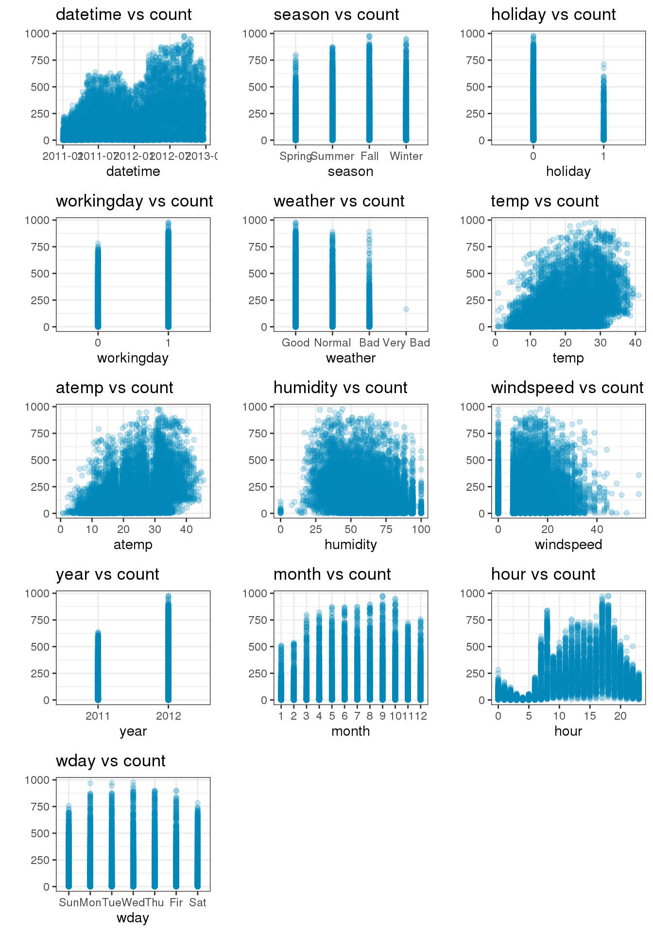
2.2 hour와 다른 변수들간의 관계
위 그림에서 count에 가장 많은 영향을 끼친 변수로는 hour임을 알 수 있었다. 그럼 이번엔 hour이 다른 변수와 어떤 관계 인지 확인 해보도록 하자.
- season: 의외로 Spring가 가장 낮은것을 확인 할수 있었다.
- holiday: 0, 1 이 뚜렷하게 구분이 되어 있다. 그러나.. 좀 더 확인해볼 필요가 있어보인다.
- workingday: 0,1 역시 뚜렷하게 구분 되어 있다.
- weather: 정말 뚜렷하게 날씨별로 구분이 되는걸 볼 수 있다.
- year: 2011년에 비해 2012년이 좀 더 많은걸 볼 수 있다.
- month: 월별로 구분이 되지만 뚜렷하게 알 수 있는 방법은 없다.
- wday: 요일별로 했을때 평일과 주말의 분포가 선명하게 보인다. 평일은 08시, 17시 (출퇴근시간), 주말은 12시에 뚜렷하게 솟아 오른걸 확인뿐만 아니라 이해를 할 수 있었다.
factor_list <- sapply(train_set_vis, is.factor) %>%
  which()

lst <- lapply(factor_list, function(i) {
  df_list <- colnames(train_set_vis)[i]

  train_set_vis %>%
    rename(aa = df_list) %>%
    group_by(aa, hour) %>%
    summarise(count = sum(count)) %>%
    ggplot(aes(x = hour, y = count, group = aa, colour = aa)) +
    labs(title = paste0("Count by ",df_list), x = "Hour",  color = df_list) +
    theme_bw() +
    geom_line()
})

grid.arrange(grobs=lst, ncol=2)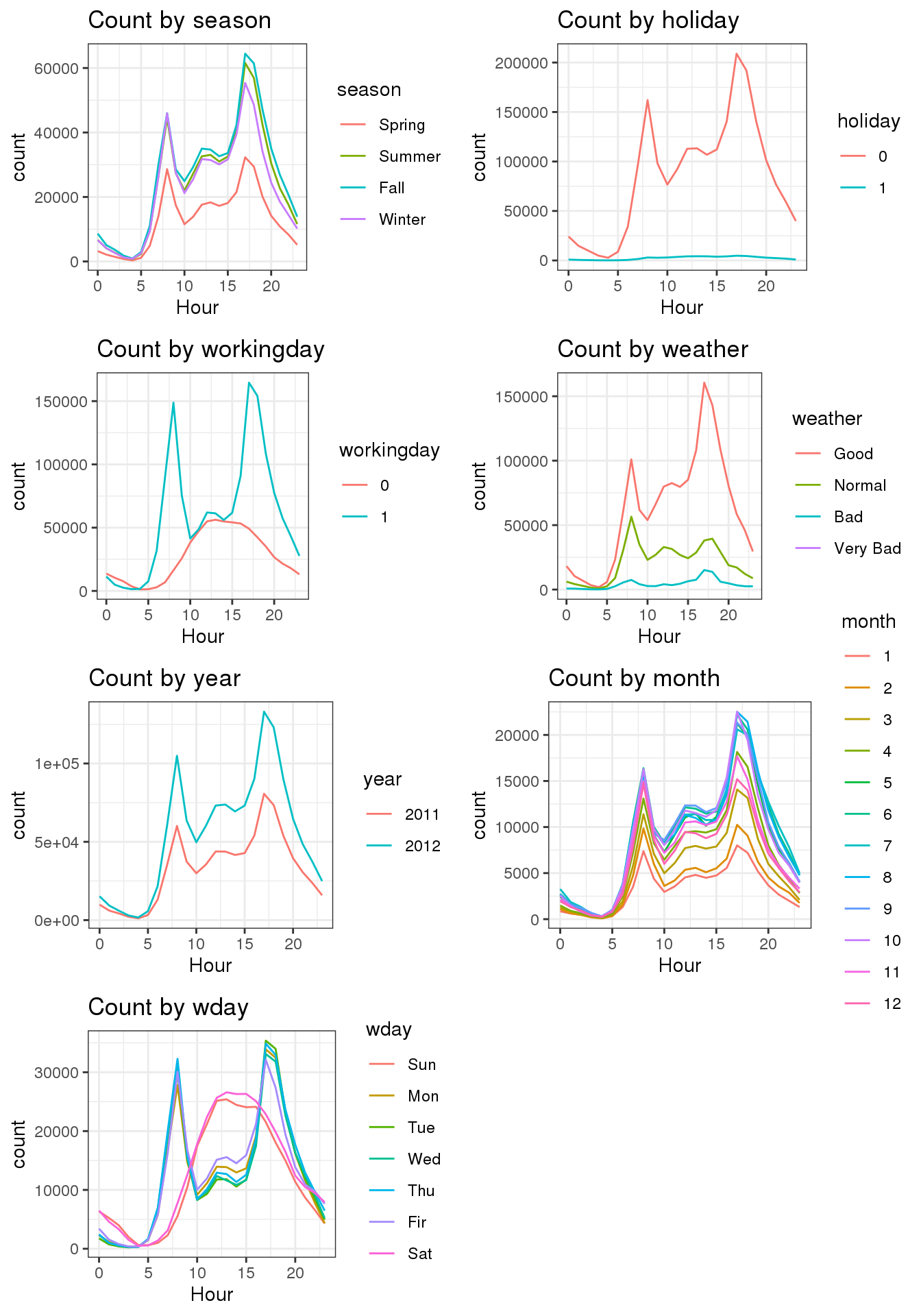
3. Xgboost
이번엔 Xgboost를 사용하여 분석을 하기 위한 사전준비를 해주자. xgboost를 돌리기 위해선 데이터의 형식이 matrix형식이 되어야 한다.
3.1 Count to log & Train / Test set 분리
Count에 log를 취해주자. 이는 RMSLE를 위한 것으로 로그를 취한 값의 RMSE를 최소화 한 것이 RMSLE가 최소화가 되기 때문이다. 또 모델을 돌릴때 datetime는 년, 월, 시간, 요일로 나누어 주었으니 빼주도록 하자.
train_set$count = log1p(train_set$count)

X_train <- train_set %>%
  select(-count, - datetime) %>%
  as.matrix()

y_train <- train_set$count

X_test = test_set %>%
  select(- datetime) %>%
  as.matrix()
3.2 Grid Search / Cross Validation 실행
Grid search와 Cross validation을 실행 해보자. xgboost를 돌리는데에 있어, 모델에 여러 조건을 넣어주기 위해 Grid search를 사용했고, 모델의 결과가 validataion에만 성능이 좋고, 실제 결과에는 성능이 좋지 않을지도 몰라 Cross validation을 해주도록 한다.(참고로 둘다 진행하는데 시간이 매우 오래 걸린다.) xgboost의 기술적인 설명은 다음 키워드를 참고하도록 하자
- 참고: Xgboost in r
dtrain = xgb.DMatrix(X_train, label = y_train)

searchGridSubCol <- expand.grid(subsample = c(0.5, 0.6),
                                colsample_bytree = c(0.5, 0.6),
                                max_depth = c(7:15),
                                min_child = seq(1),
                                eta = c(0.05,0.1,0.15)
)


ntrees <- 150

rmseErrorsHyperparameters <- apply(searchGridSubCol, 1, function(parameterList){

  #Extract Parameters to test
  currentSubsampleRate <- parameterList[["subsample"]]
  currentColsampleRate <- parameterList[["colsample_bytree"]]
  currentDepth <- parameterList[["max_depth"]]
  currentEta <- parameterList[["eta"]]
  currentMinChild <- parameterList[["min_child"]]

  xgboostModelCV <- xgb.cv(data =  dtrain, nrounds = ntrees, nfold = 5, showsd = TRUE,
                           metrics = "rmse", verbose = TRUE, "eval_metric" = "rmse",
                           "objective" = "reg:linear", "max.depth" = currentDepth, "eta" = currentEta,
                           "subsample" = currentSubsampleRate, "colsample_bytree" = currentColsampleRate
                           , print_every_n = 10, "min_child_weight" = currentMinChild, booster = "gbtree",
                           early_stopping_rounds = 10)

  xvalidationScores <- as.data.frame(xgboostModelCV$evaluation_log)
  rmse <- tail(xvalidationScores$test_rmse_mean, 1)
  trmse <- tail(xvalidationScores$train_rmse_mean,1)
  output <- return(c(rmse, trmse,currentSubsampleRate, currentColsampleRate, currentDepth, currentEta, currentMinChild))})


output <- as.data.frame(t(rmseErrorsHyperparameters))
varnames <- c("TestRMSE", "TrainRMSE", "SubSampRate", "ColSampRate", "Depth", "eta", "currentMinChild")
names(output) <- varnames
3.3 Grid Search / Cross Validation 결과
Grid Search / Cross Validation결과를 보자. tail()함수를 사용해서 마지막 6개만 뽑았으며, 결과는 다음과 같다. 이중에서 RMSE가 가장 낮은걸 선택하여 후에 지수화 하여 RMSLE가 낮은걸 선택하게 하려고 한다.
tail(output)## TestRMSE TrainRMSE SubSampRate ColSampRate Depth eta currentMinChild
## 103 0.3216806 0.0405674 0.5 0.6 14 0.15 1
## 104 0.3347492 0.0163242 0.6 0.6 14 0.15 1
## 105 0.3538918 0.0240652 0.5 0.5 15 0.15 1
## 106 0.3666650 0.0172654 0.6 0.5 15 0.15 1
## 107 0.3385042 0.0268824 0.5 0.6 15 0.15 1
## 108 0.3265528 0.0193902 0.6 0.6 15 0.15 13.4 Model
Grid search & Cross Validation 결과 최적의 파라미터를 적용해 다음의 파라미터를 집어넣어 결과를 보도록 하자. 그리고 xgboost에서 어떤 변수가 가장 의미가 있었는지 순서대로 확인할 수가 있다.
model = xgb.train(data = dtrain,
                  nround = 150,
                  max_depth = 10,
                  eta = 0.15,
                  subsample = 0.6,
                  colsample_bytree = 0.6,
                  min_child_weight = 1)


xgb.importance(feature_names = colnames(X_train), model) %>%
  xgb.plot.importance()
preds = predict(model, X_test)
preds = expm1(preds)

solution = data.frame(datetime = test_set$datetime, count = preds)

write.csv(solution, "solution.csv", row.names = FALSE)
4. Score
이렇게 돌린 결과 RMSLE는 0.41653이 나왔다. 최고 점수가 0.33756(2020-03-11 기준)에 비해 부족한 수준이지만, 앞으로 여러 캐글을 필사하면서 좀 더 성능을 높게할 수 있는 방법을 찾아보도록 하자.
