이번에는 볼린져밴드에 대해 알아보고 plotly에 subplot 개념을 적용하여 여러개의 그래프를 나눠서 추가 해보자. 볼린져 밴드와 함께 거래량도 알아보면서 주식 시장에 대한 과매수 과매도 상황을 알아보려고 한다. 역시 볼린져 밴드는 알파스퀘어 에서 잘 정리 해둔 내용을 참고 하려고 한다.
알파스퀘어 기술적 지표
볼린저 밴드 (Bollinger Bands)
미국의 재무분석가 존 볼린저 (John A. Bollinger, 1950년 5월 27일 ~)가 1980년대 초반에 개발한 기술적 분석 도구 이다. 그리고 이는 2011년 상표권을 취득하여 정식으로 인정받았다고 한다. 볼린저 밴드는 주가의 변동을 분석하기 위해, 중심이 되는 이동 평균선을 기준으로 일정한 표준편차를 두어 주가가 상한선 및 하한선 사이에서 움직일 가능성을 평가 하는 도구 이다.
볼린저 밴드 개념
볼린저 밴드를 이해 하기 위해서는 정규분포와 그에 따른 표준편차에 대한 약간의 이해가 필요하다.
볼린저 밴드의 계산식을 보자.
- 볼린저 밴드의 상한선: 20일의 이동평균선 값 + 표준편차 * 2
- 볼린저 밴드의 하한선: 20일의 이동평균선 값 - 표준편차 * 2
기본적으로 볼린저 밴드는 20일의 이동평균선을 중심으로 표준편차의 두배에 해당하는 값을 상/하한선으로 둔다. 여기서 왜 표준편차의 2배에 대한 값을 사용하는지에 대해 한번 파악해보자. 다음을 보자.
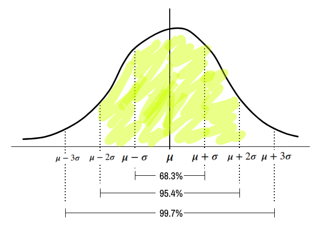
\(\mu\) 를 기준으로 \(\mu + 2\sigma\)와 \(\mu - 2\sigma\) 에 해당하는 넓이는 0.954이다. 즉 이를 %로 표현 하면 95.4% 인데 역으로 이 밖에 있을 확률은, 각각 5% 이며 위로 아래로는 각각 2.5% 이다. 이제 이를 주식 차트에 응용 해보자. 볼린저 밴드는 이를 응용하여 주가는 표준편차의 2배 에 해당하는 값을 벗어날 확률이 고작 5%라는 개념을 도입한 것이다.
한계
물론 주가수익률은 정규분포를 따르지 않고, 중심극한 정리를 위한 이동평균의 수도 충분하지 않다. 그리고 95%와는 달리 실제로는 88%만이 밴드 내에 머무른다고 한다.
분석방법
그럼에도 볼린저 밴드를 사용하고 참고 하기위한 방법은 여러가지가 있다. 평균회귀 전략, 추세추종 전략, 스퀴즈 전략, 쌍바닥 패턴 식별 등등이 있는데 이번에는 평균회귀 전략에 대해서만 다루도록 한다.
평균회귀 전략
볼린저밴드를 사용한 분석방법중 하나인 평균회귀 전략에 대해 알아보자. 앞서 볼린저밴드의 기본 개념은 2 * 표준편차에서 벗어나는 경우는 정상에서 벗어났난 경우라고 판단 하고 있다. 즉, 정상적인 95%를 벗어났다는것. 그리고 벗어난 데이터는 다시 회귀 하려는 성질을 갖고 있다는 것. 그에 따른 전략으로는 주가가 상단이나 하단에 근접 했을 경우 시장이 과매수 또는 과매도 국면에 달했을 가능성이 있다고 판단한다.
- 밴드 하단을 상향 돌파 했을 경우 매수
- 밴드 상단을 하향 돌파 했을 경우 매도
또한 이는 시장이 뚜렷한 상승, 하강 추세를 보일때 보다는 박스권 장세를 보일 때 매매 한다.
파이썬을 사용한 시각화
그럼 이제 Plotly를 사용하여 이를 구현 해보도록 하자.
데이터 수집
데이터 수집 부분은 다음과 같다.
import plotly.graph_objects as go

from ta.trend import MACD
from ta.momentum import StochasticOscillator

import numpy as np
import pandas as pd
from pykrx import stock
from pykrx import bond
from time import sleep

from datetime import datetime
from datetime import timedelta
import os
import time
from plotly.subplots import make_subplots
import glob


ticker_nm = '005930'
start_date  = '20200101'
today_date1 = '20231006'

df_raw = stock.get_market_ohlcv(start_date, today_date1, ticker_nm)
df_raw = df_raw.reset_index()
df_raw['ticker'] = ticker_nm

df_raw.columns = ['date', 'open', 'high', 'low', 'close', 'volume','trading_value','price_change_percentage', 'ticker']
전처리
이동평균선
우선 이동평균선을 추가 해주자. 종가(close)를 기준으로 rolling() 함수를 사용하여 계산해준다. 그리고 이를 각각 MA5, MA20, MA60, MA120으로 만들어 준다. 추가로 이 전처리한 데이터들은 Airflow에서 처리 하는 과정은 나중에 업로드 할 예정이다.
df_raw['MA5'] = df_raw['close'].rolling(window=5).mean()
df_raw['MA20'] = df_raw['close'].rolling(window=20).mean()
df_raw['MA60'] = df_raw['close'].rolling(window=60).mean()
df_raw['MA120'] = df_raw['close'].rolling(window=120).mean()
볼린저밴드 계산
볼린저 밴드는 기본적으로 다음과 같이 계산 한다.
- 볼린저 밴드의 상한선: 20일의 이동평균선 값 + 표준편차 * 2
- 볼린저 밴드의 하한선: 20일의 이동평균선 값 - 표준편차 * 2
std = df_raw['close'].rolling(20).std(ddof=0)

df_raw['upper'] = df_raw['MA20'] + 2 * std
df_raw['lower'] = df_raw['MA20'] - 2 * std
날짜
데이터는 2019년도 부터 수집 되어있지만 이동평균 120일을 하게 되면 NA가 생긴다 (처음 120일 정도) 따라서 이는 미리 처리하고 2023년 3월 부터 시각화에 볼 수 있도록 처리 해주었다.
df_raw = df_raw[df_raw['date'] > '2023-03-01']
df_raw = df_raw.reset_index(drop = True)
볼린져밴드 상향,하향 회귀 계산
이제 볼린저밴드의 상향,하향 회귀하는 날짜를 계산 해주자
down_reg_sq = df_raw['upper'] - df_raw['close']
top_reg_sq  = df_raw['lower'] - df_raw['close']

down_reg = [idx for idx in range(1,len(df_raw)) if down_reg_sq[idx] > 0 and down_reg_sq[idx-1] <= 0]
top_reg = [idx for idx in range(1,len(df_raw)) if top_reg_sq[idx] < 0 and top_reg_sq[idx-1] >= 0]

down_reg_df = pd.DataFrame({
    'index':down_reg,
    'name':'하향 회귀'})

top_reg_df = pd.DataFrame({
    'index':top_reg,
    'name':'상향회귀'})

cross_df = pd.concat([down_reg_df, top_reg_df])
cross_df = cross_df.reset_index(drop = True)
시각화
시각화 분할
시각화 분할을 진행 해주자. make_subplots()를 사용하여 plotly에 여러개의 그래프를 나눠서 추가해주자. 추가할 내용은 거래량 이다. plotly에서 go를 사용한 시각화에서 기본적으로 Figure를 사용했다. 이번에는 make_subplots()에 옵션을 주어 row 2개, columns 1개인 시각화를 진행 할 예정. 여기서 row_heights=[0.7, 0.3] 옵션은, 2개의 row의 각 비율이다.
# fig = go.Figure()
fig = make_subplots(rows=2, cols=1, shared_xaxes=True, vertical_spacing=0.01, row_heights=[0.7, 0.3])
row =1, col =1 기본 차트 추가
이제 캔들스틱, 이동평균 시각화를 추가 해준다. 여기서 유의해야할 점은, 각 시각화에 row, col을 지정해주어야 한다. 그래야 각 시각화가 해당 위치에 들어간다.
# 캔들스틱차트
fig.add_trace(go.Candlestick(
    x=df_raw['date'],
    open=df_raw['open'],
    high=df_raw['high'],
    low=df_raw['low'],
    close=df_raw['close'],
    increasing_line_color= 'red', decreasing_line_color= 'blue',
    name = ''), row = 1, col = 1)

# MA 5
fig.add_trace(go.Scatter(x=df_raw['date'],y=df_raw['MA5'],
                         opacity=0.7,
                         line=dict(color='blue', width=2),
                         name='MA 5') , row = 1, col = 1)

# MA 20
fig.add_trace(go.Scatter(x=df_raw['date'],y=df_raw['MA20'],
                         opacity=0.7,
                         line=dict(color='orange', width=2),
                         name='MA 20'), row = 1, col = 1)

# MA 60
fig.add_trace(go.Scatter(x=df_raw['date'],y=df_raw['MA60'],
                         opacity=0.7,
                         line=dict(color='purple', width=2),
                         name='MA 60'), row = 1, col = 1)

# MA 120
fig.add_trace(go.Scatter(x=df_raw['date'],y=df_raw['MA120'],
                         opacity=0.7,
                         line=dict(color='green', width=2),
                         name='MA 120'), row = 1, col = 1)
이제 추가로 볼린저 밴드를 넣어 주자. go.scatter() 에 상한선, 하한선을 그었고 fill 옵션에 ’toself’를 넣어 주어 상한선, 하한선 사이에 색칠을 해준다.
fig.add_trace(go.Scatter(
    x=pd.concat([df_raw['date'], df_raw['date'][::-1]]),
    y=pd.concat([df_raw['upper'], df_raw['lower'][::-1]]),
    fill='toself',
    fillcolor='rgba(255,255,0,0.1)',
    line=dict(color='rgba(255,255,255,0.2)', width=2),
    name='Bollinger Band',
    showlegend=False
), row = 1, col = 1)
그리고 상향, 하향 회귀 하는 데이터를 넣어주고 fig.add_annotation()를 사용하여 화살표와 텍스트를 처리 해준다.
# 상향, 하향 회귀
for i in range(len(cross_df)):
    cross_index = cross_df['index'][i]
    cross_name = cross_df['name'][i]

    cross_date = df_raw['date'][cross_index]
    cross_value = df_raw['close'][cross_index]

    fig.add_annotation(x=cross_date, y=cross_value,
        text=cross_name,
        showarrow=True,
        arrowhead=1)
row = 2, col =1 거래량 추가
# Row 2
# volume
colors = ['blue' if row['open'] - row['close'] >= 0
          else 'red' for index, row in df_raw.iterrows()]

fig.add_trace(go.Bar(x=df_raw['date'],
                     y=df_raw['volume'],
                     marker_color=colors,
                     name = 'Volume',
                     showlegend=False
                    ), row=2, col=1)
rayout 설정
rayout을 설정 해준다. 여기서 알아두면 좋은 건 각 위치의 시각화에 제목을 지어 주는것이다. fig.update_yaxes()를 사용하여 y축에 제목을 넣어 주어 각 시각화의 제목을 설정 해주었다.
- fig.update_yaxes(title_text=“Price”, row=1, col=1)
- fig.update_yaxes(title_text=“Volume”, row=2, col=1)
# Rayout
fig.update_layout(
    title = '삼성전자 주가',
    title_font_family="맑은고딕",
    title_font_size = 18,
    hoverlabel=dict(
        bgcolor='black',
        font_size=15,
    ),
    hovermode="x unified",
    template='plotly_dark',
    xaxis_tickangle=90,
    yaxis_tickformat = ',',
    legend = dict(orientation = 'h', xanchor = "center", x = 0.5, y= 1.2),
    barmode='group',
    margin=go.layout.Margin(
        l=10, #left margin
        r=10, #right margin
        b=10, #bottom margin
        t=100  #top margin
    ),
    height=400, width=900,
#     showlegend=False,
    xaxis_rangeslider_visible=False
)


# update y-axis label
fig.update_yaxes(title_text="Price", row=1, col=1)
fig.update_yaxes(title_text="Volume", row=2, col=1)

fig.update_xaxes(rangebreaks=[dict(bounds=["sat", "mon"])])
fig.show()
최종 코드
그리고 이를 최종적으로 함수를 만들어 주면 다음과 같다. 이제 곧 Streamlit 대시보드를 생성 하게 되면 이렇게 잘 정리된 함수들이 꼭 필요하다.
def bolinger_bands(df_raw):
    # fig = go.Figure()
    fig = make_subplots(rows=2, cols=1, shared_xaxes=True, vertical_spacing=0.01, row_heights=[0.7, 0.3])

    # 캔들스틱차트
    fig.add_trace(go.Candlestick(
        x=df_raw['date'],
        open=df_raw['open'],
        high=df_raw['high'],
        low=df_raw['low'],
        close=df_raw['close'],
        increasing_line_color= 'red', decreasing_line_color= 'blue',
        name = ''), row = 1, col = 1)

    # MA 5
    fig.add_trace(go.Scatter(x=df_raw['date'],y=df_raw['MA5'],
                             opacity=0.7,
                             line=dict(color='blue', width=2),
                             name='MA 5') , row = 1, col = 1)

    # MA 20
    fig.add_trace(go.Scatter(x=df_raw['date'],y=df_raw['MA20'],
                             opacity=0.7,
                             line=dict(color='orange', width=2),
                             name='MA 20'), row = 1, col = 1)

    # MA 60
    fig.add_trace(go.Scatter(x=df_raw['date'],y=df_raw['MA60'],
                             opacity=0.7,
                             line=dict(color='purple', width=2),
                             name='MA 60'), row = 1, col = 1)

    # MA 120
    fig.add_trace(go.Scatter(x=df_raw['date'],y=df_raw['MA120'],
                             opacity=0.7,
                             line=dict(color='green', width=2),
                             name='MA 120'), row = 1, col = 1)


    fig.add_trace(go.Scatter(
        x=pd.concat([df_raw['date'], df_raw['date'][::-1]]),
        y=pd.concat([df_raw['upper'], df_raw['lower'][::-1]]),
        fill='toself',
        fillcolor='rgba(255,255,0,0.1)',
        line=dict(color='rgba(255,255,255,0.2)', width=2),
        name='Bollinger Band',
        showlegend=False
    ), row = 1, col = 1)


    # 상향, 하향 회귀
    for i in range(len(cross_df)):
        cross_index = cross_df['index'][i]
        cross_name = cross_df['name'][i]

        cross_date = df_raw['date'][cross_index]
        cross_value = df_raw['close'][cross_index]

        fig.add_annotation(x=cross_date, y=cross_value,
            text=cross_name,
            showarrow=True,
            arrowhead=1)


    # Row 2
    # volume
    colors = ['blue' if row['open'] - row['close'] >= 0
              else 'red' for index, row in df_raw.iterrows()]

    fig.add_trace(go.Bar(x=df_raw['date'],
                         y=df_raw['volume'],
                         marker_color=colors,
                         name = 'Volume',
                         showlegend=False
                        ), row=2, col=1)


    # Rayout
    fig.update_layout(
        title = '삼성전자 주가',
        title_font_family="맑은고딕",
        title_font_size = 18,
        hoverlabel=dict(
            bgcolor='black',
            font_size=15,
        ),
        hovermode="x unified",
        template='plotly_dark',
        xaxis_tickangle=90,
        yaxis_tickformat = ',',
        legend = dict(orientation = 'h', xanchor = "center", x = 0.5, y= 1.2),
        barmode='group',
        margin=go.layout.Margin(
            l=10, #left margin
            r=10, #right margin
            b=10, #bottom margin
            t=100  #top margin
        ),
        height=400, width=900,
    #     showlegend=False,
        xaxis_rangeslider_visible=False
    )


    # update y-axis label
    fig.update_yaxes(title_text="Price", row=1, col=1)
    fig.update_yaxes(title_text="Volume", row=2, col=1)

    fig.update_xaxes(rangebreaks=[dict(bounds=["sat", "mon"])])
    return fig
총평
이번에는 주가 보조지표인 볼린저밴드와 Plotly에서 subplot을 사용해 화면을 분할 하는 방법에 대해 알아 보았다. 볼린저밴드 역시 자주쓰는 지표이기는 하지만 다른 추가 지표와 같이 쓰이니 앞으로 차차 알아보자.